Logo
Brand Style Guide

Logo Usage
The Meyers Heating + Air logo represents the promise that Meyers makes to our customers to provide excellent, reliable service to our customers and provide the comfort they seek through the various seasons of Colorado. Always make sure the logo is displayed consistently. It’s the ultimate calling card and the cornerstone of the brand. Following these guidelines will ensure that we use the logo correctly when we decide to place it on any materials.
Primary horizontal logo
The horizontal, full-color gradient version of the logo is preferred for most applications, with a reverse variant available when placed on dark backgrounds. A complete grayscale reverse version of the logo is available but should only be used when absolutely necessary.

Logo Mark
Additionally, the Meyers Heating + Air logomark may be used alone as a design element. Due to its ascending, springlike shape, it can often bridge individual elements or cover a background with an abstract shape. When used as a design element, the logomark is free from the “Do Not” rules listed below, but should still be treated with respect.
Correct Logo Usage
AREA OF ISOLATION
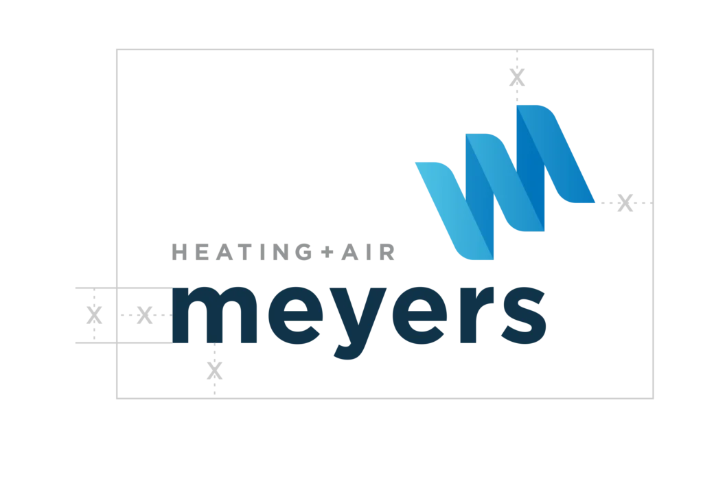
To help your logo stand out, we need to give it some space. This space is called the “area of isolation.” It strengthens the logo and makes it more prominent. This rule applies to all printed and electronic communications, including signage, and any cobranded materials.
X IS A UNIT OF MEASUREMENT
X is equal to the width of the mark and is an important measurement that will be referred to throughout this guide as the area of isolation.
MINIMUM AREA OF ISOLATION
A distance of X should be maintained between the
Meyers logo and all other design elements including images, typography, photos, graphics, rules, and the substrate or page edge.
PREFERRED ISOLATION
The area of isolation is a minimum space recommendation. Increase the area of isolation whenever possible.
MINIMUM SIZE REQUIREMENTS
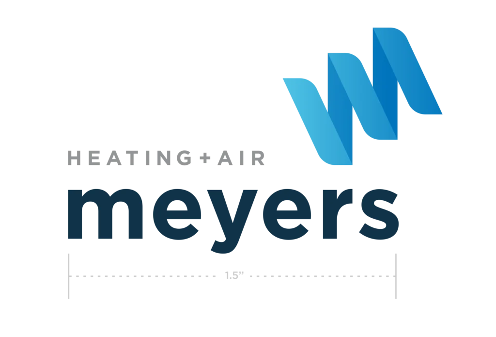
If we have to strain to see the logo, it’s too small. The logo should not be reduced smaller than 1.5″ for the Meyers text where possible.
In most cases, this means the height of the mark should never be less than 1.25”. This is the minimum size – it should be used larger in every possible instance.
Web Usage Color Rules

Primary
Use on white backgrounds
Primary
Use on navy background
Navy Text
For Use On Lime or Brighter Backgrounds to Increase Readability Where Gray Does Not Contrast Sufficiently

Navy Text
For Use On Gray Backgrounds to Increase Readability Where Gray Does Not Contrast Sufficiently
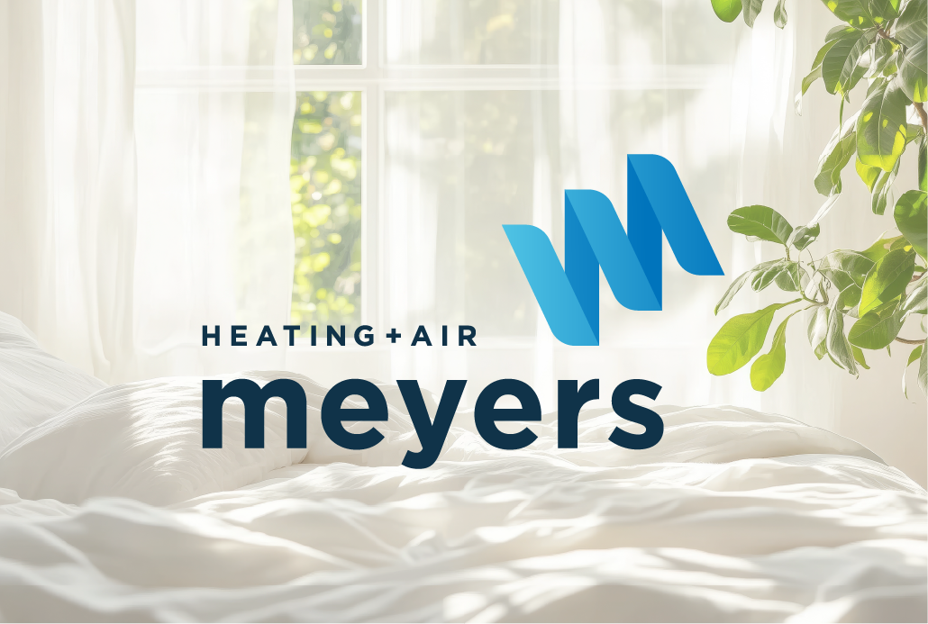
Navy Text
For Use On Image Backgrounds to Increase Readability Where Gray Does Not Contrast Sufficiently
Flat Grayscale
For Black and White Printing on Darker Backgrounds
Flat Grayscale
For Black and White Printing on Lighter Backgrounds
Incorrect Logo Use
You may feel the urge to be creative with your logo, but please resist this urge. Sometimes the best way to understand how to do something right is by seeing the wrong way of doing things. To ensure you’re using the Meyers logo properly, here are a few examples of exactly what not to do with it.
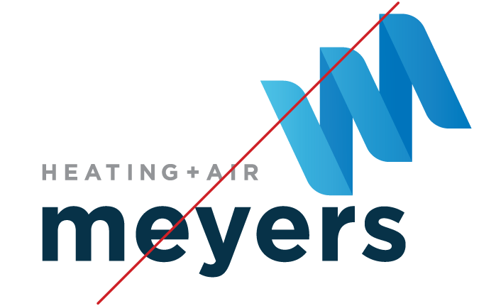
Do Not
Alter proportions of the logo
Do Not
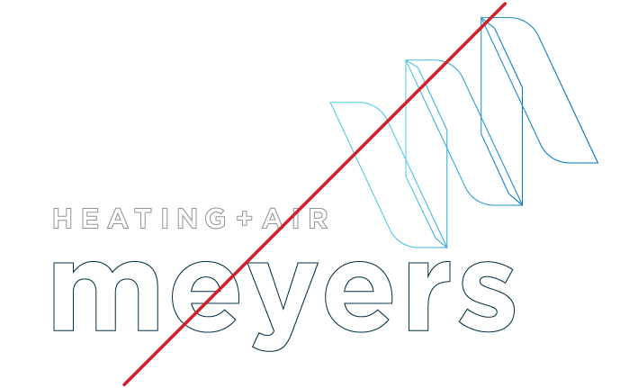
Outline the logo

Do Not
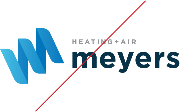
Distort the logo in any way
Do Not
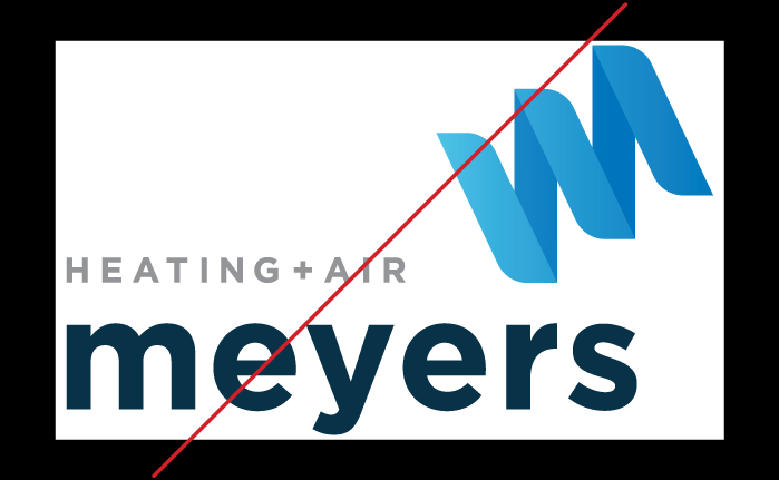
Rearrange elements of the logo
Do Not
Breach the area of isolation
Do Not
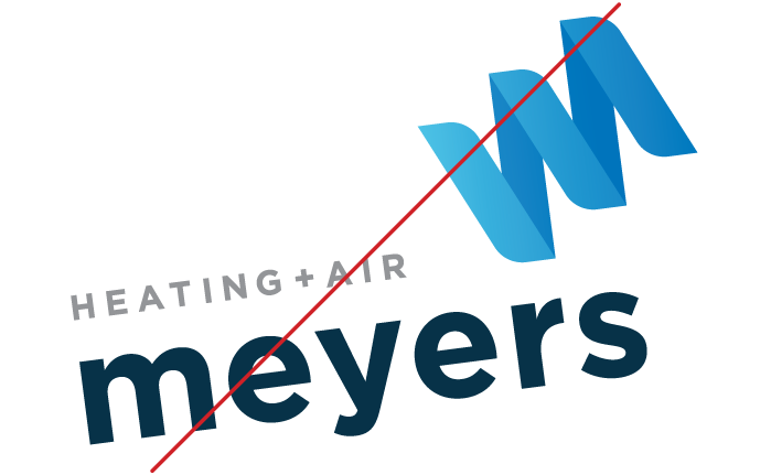
Rotate or use the logo on an angle
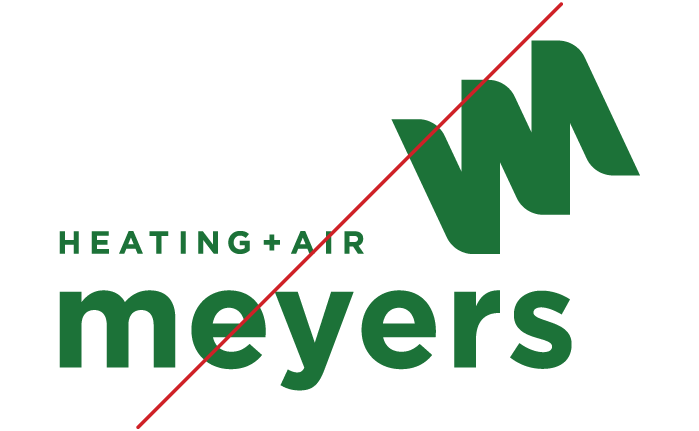
Do Not
Use unapproved colors in the logo
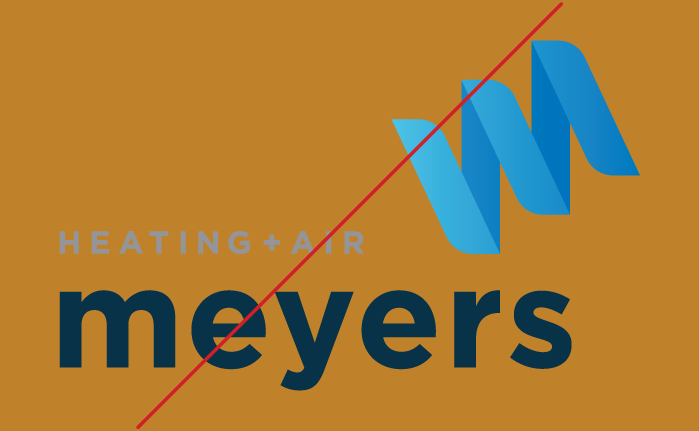
Do Not
Put the logo on unapproved colors or complex backgrounds
Let the zebra hooves hit the ground running. Our bold and current look is turning heads. We’re breaking out of the black and white zebra pack with bold colors that establish a style unlike other wellness companies.

© Copyright 2019-2025 Meyers Heating + Air. All rights reserved.